First half of 2017 was 2nd warmest such period on record
Posted on Categories Discover Magazine

The month of June by itself was third warmest in records dating back 138 years, according to NOAA
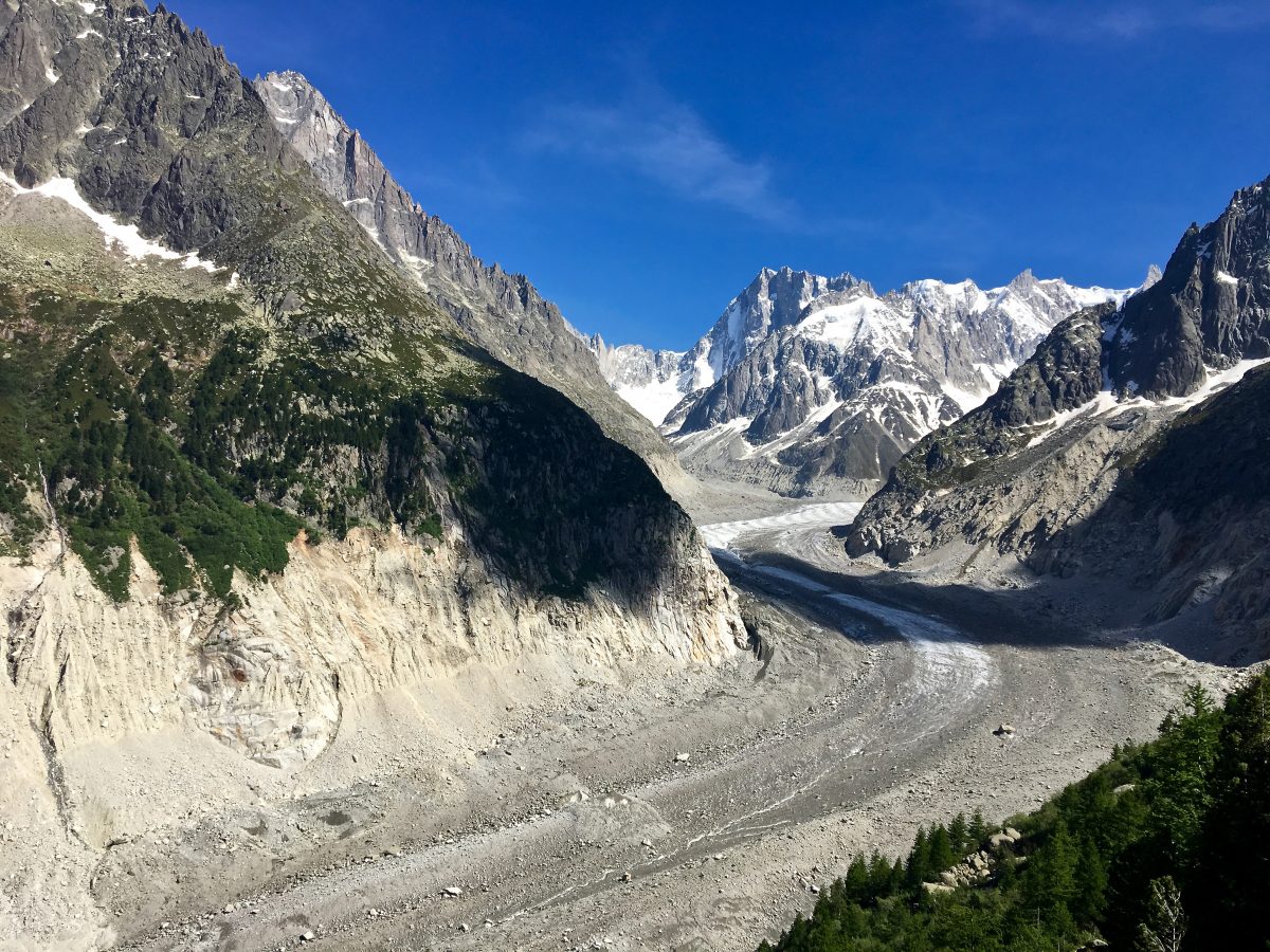
The Mer de Glace, or “Sea of Ice,” is the best known part of the Mount Blanc Glacier in France. It has been receding rapidly for the past 30 years, now at a rate of about 15 feet each year. (Photo courtesy of Wendy Redal)
The Earth has been cooling somewhat since the epic El Niño of 2015/2016. But even so, conditions are still plenty warm.
The National Oceanic and Atmospheric Administration rates January through June of 2017 as the second warmest first half of any year since record-keeping began in 1880, behind the record year of 2016.
The year-to-date temperature across global land and ocean surfaces was 1.64°F above the 20th century average of 56.3°F, according to NOAA.
If that does not seem like very much, consider how miserable you feel when you spike a fever that’s only a couple of degrees above normal.
Or, for something directly connected to the warming of our planet, consider the photograph above, taken by my friend Wendy Redal during a trip to France in June. It shows the Mer de Glace, or “Sea of Ice,” an extension of the Mont Blanc Glacier.
Since 1850, the Mer de Glace has retreated by two kilometers, or 1.2 miles. You can see what that shrinkage looks like in this comparison:
As these comparison images show, the ice is not just retreating. It is also thinning — dramatically.
In 1915, it was a short walk from the terrace visible in the lower right corner to the glacier. Since a new cable car system accessing the site was completed in 1988, engineers have had to add more than 400 steps to allow visitors to access the glacier.
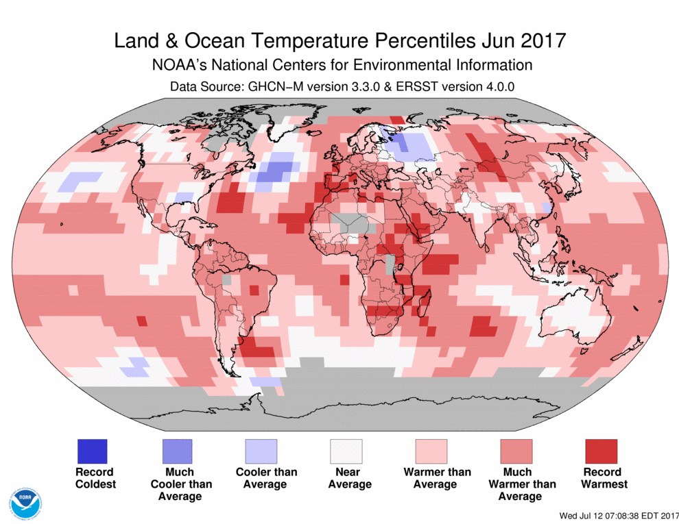
The month of June alone was also very warm. As NOAA’s report describes it:
The June temperature across global land and ocean surfaces was 1.48°F above the 20th century average of 59.9°F. This was the third highest value for June in the 138-year period of record, behind 2016 and 2015. June 2017 marks the 41st consecutive June and the 390th consecutive month with temperatures at least nominally above the 20th century average.
NASA’s Goddard Institute for Space Studies, which also tracks global temperature, reached a slightly different conclusion for June, pegging it as the fourth warmest on record.

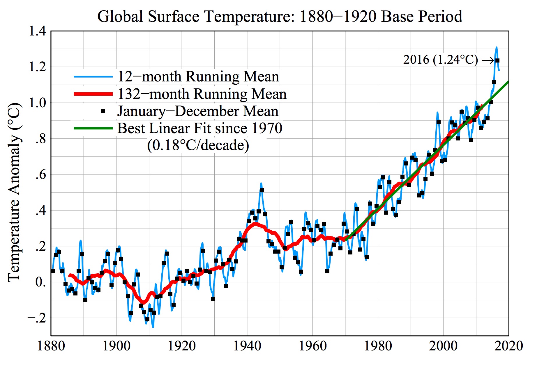
Here’s how global surface temperature varied from the 1880 to 1920 base period, through June 2017. (Source: NASA GISTEMP & Makiko Sato, Columbia University)
Month-to-month, and even year-to-year variations in global temperature aren’t as meaningful as the trend over the course of decades. To see what that trend looks like, consider the graph above. It shows how temperatures have varied from a based period figured from 1880 to 1920.
That base period allows us to get a sense of the magnitude of warming relative to pre-industrial time. (Since reliable temperature records are pretty sparse prior to 1880, the base period starts there.)
Year to year, there is a great deal of variation — thanks to such natural factors as El Niño, which causes warming, and La Niña, which induces cooling. But the 132-month running mean, shown in red, smooths out those up and down spikes to provide a better sense of the long term picture.
If you’re wondering why 132 months was chosen, consider that this is 11 months — the length of a solar cycle, during which the energy output from the Sun cycles up and down. “The 11-year running mean does a pretty good job of taking out solar cycle variability and shorter-term variability such as the Southern Oscillation,” according to an explanatory paper accompanying the graph.
That red line explains very well what has happened to the Mer de Glace — why it looks so meager in the photograph by my friend Wendy compared to the image from 1915.

