Size and Color Saturation, a Perceptual Connection?
Author Vishay SinghPosted on Categories Discover Magazine
Paint a room in light colors to make it look bigger. Wear black to look slimmer. These are well known facts about how color influences our perception—but it’s not all black and white.
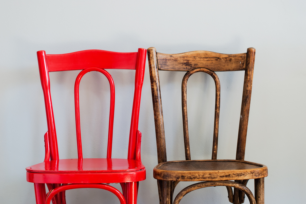
New research from Boston College is showing that color saturation — how pure a color is — affects how we perceive an objects’ size. The more saturated a color is, the bigger something looks, the researchers say, with attendant implications for marketing and design. More than that, however, their findings also hint at how much more we need to learn about the ways colors influence cognition.
From Art to Science
The impetus for the study came not from the literature but from a previous life. Henrik Hagtvedt, now an associate professor of marketing at Boston College, was for nearly a decade an artist whose work garnered international exhibitions. In the mid-2000s he switched careers and became an academic, focusing on the intersection of marketing and art.
“Because my background is as a painter I have a number of … perceptual phenomena that are more within the realm of intuition than systematic knowledge,” Hagtvedt says.
The impact of color saturation is one of the intuitive effects Hagtvedt is now exploring rigorously, and some of his latest findings were recently published in the Journal of Consumer Research. Along with co-author Adam Brasel, Hagtvedt performed a few different experiments looking at the ways color saturation distorts perception.
Color Me Intrigued
In one, they asked participants to fill a cup with as much jellybeans as they wanted — when the cup’s color was more saturated, they took more candy. Another asked them to estimate the size of a laptop that was either saturated or not. The more saturated laptop was perceived as bigger. A third had them rate suitcases: Those who wanted large suitcases rated the more saturated version as larger.
In all they conducted six experiments, and each reinforced the theory that more pure colors make objects appear bigger. Hagtvedt thinks it could have something to do with how saturated colors grab our eyes.
“What we find in our studies is that more saturated color is arousing, it arouses a certain level of excitement. And because it has that quality it also attracts our attention,” he says. “The effects of attracting attention causes an object to seem larger.”
This aligns with previous research that finds that bigger things tend to better grab attention. It then stands to reason that we would expect attention-grabbing things to be bigger as well.
Coloring in the Blanks
While the findings are fairly intuitive, Hagtvedt says research on this narrow topic is sparse. While there’s been some research linking saturation and anxiety (anxious people don’t like it as much), attention (things that catch our attention look more saturated) and preference (one study says people prefer more saturated colors, another says they don’t), most of this research is isolated and piecemeal.
Indeed, the only literature he came across on saturation and size actually found the opposite effect.
“I looked at it like ‘there is no way,’” Hagtvedt says. “Something strange must have happened there. We ran a number of studies and we did not manage to flip our effects.”
Their study is small for the moment, but the plurality of tests adds weight to conclusion. The findings have obvious applications in marketing and packaging, as well as in website design and other commercial fields. But, Hagtvedt and Brasel are also helping to illuminate an understudied area of color research, one that takes both the intuition of an artist and the rationality of a scientist to fully explore.
Luckily, Hagtvedt is up for the task.