Nearly two decades of revealing satellite images now available at your fingertips
Author Vishay SinghPosted on Categories Discover Magazine
Bear witness to the changing face of our planet using an easy-to-use tool for accessing a trove of satellite data
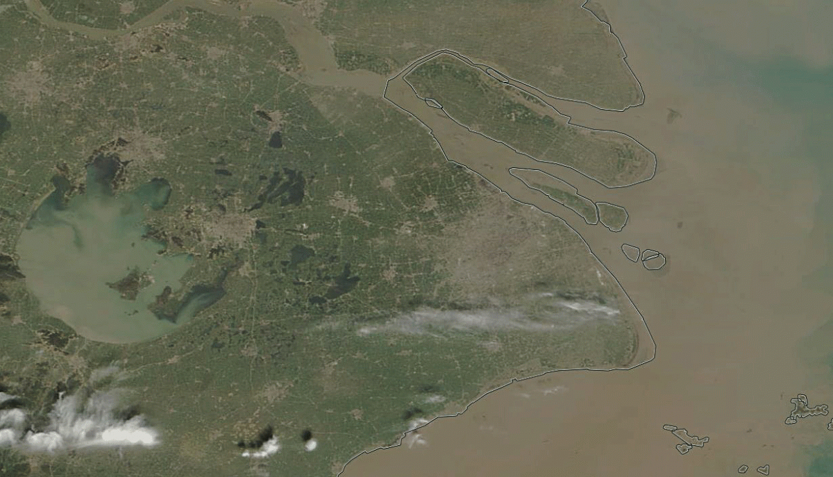
A comparison of views of Shanghai acquired by NASA’s Terra satellite, one on March 26, 2000, and the other on March 10, 2018. (Images: NASA Worldview. Animation: Tom Yulsman)
The longest continuous daily satellite observation record of Earth ever compiled is now available for all of us to peruse. All you need is access to a computer.
Multiple instruments aboard NASA’s Terra and Aqua satellites, launched in 1999 and 2002, respectively, have kept close watch on the virtually the entire planet for nearly 20 years. Now, for the first time, the entire treasure trove of imagery and scientific information is available for exploration in Worldview, an engaging, interactive web-based application.
I’ve been using Worldview regularly to find imagery for use here at ImaGeo since I launched the blog in 2013. But until now, there was a significant limitation: The data available went back only to 2012. Now, after more than five years of work, NASA has extended what’s available on Worldview back to the year 2000, when the Terra satellite first became operational.
Terra was lofted into polar orbit with a suite of five remote sensors. The most comprehensive is an instrument called the Moderate-resolution Imaging Spectroradiometer, or MODIS. Here’s NASA’s explanation of MODIS, which is also carried aboard the Aqua satellite Terra’s twin:
MODIS offers a unique combination of features: it detects a wide spectral range of electromagnetic energy; it takes measurements at three spatial resolutions (levels of detail); it takes measurements all day, every day; and it has a wide field of view. This continual, comprehensive coverage allows MODIS to complete an electromagnetic picture of the globe every two days. MODIS’s frequent coverage complements other imaging systems such as Landsat’s Enhanced Thematic Mapper Plus, which reveals the Earth in finer spatial detail, but can only image a given area once every 16 days— too infrequently to capture many of the rapid biological and meteorological changes that MODIS observes.
Now, all of that data, and a total of more than 600 satellite imagery products covering every part of the world, are available on Worldview.
I decided to mark the occasion by creating animations that compare imagery acquired by Terra in the years 2000 and 2018. I picked examples that I thought would illustrate the power of this long-running remote sensing campaign to reveal how the planet is changing.
The image at the top of the post shows Shanghai, as spied by Terra in March of 2000, and then this year — 18 years later.
In 2000, the city’s population stood at about 14 million people. In the animation, the greener image is from that time period. This makes sense, because the main part of the city — which sits near the mouth of the big river, the Yangtze — is surrounded by agricultural fields and other open spaces.
Flash forward to the present: The city has swelled to more than 24 million people. You can see the dramatic effect that has had on the landscape in the grayer image. Much of the green has been obliterated by development — roads, buildings, etc.
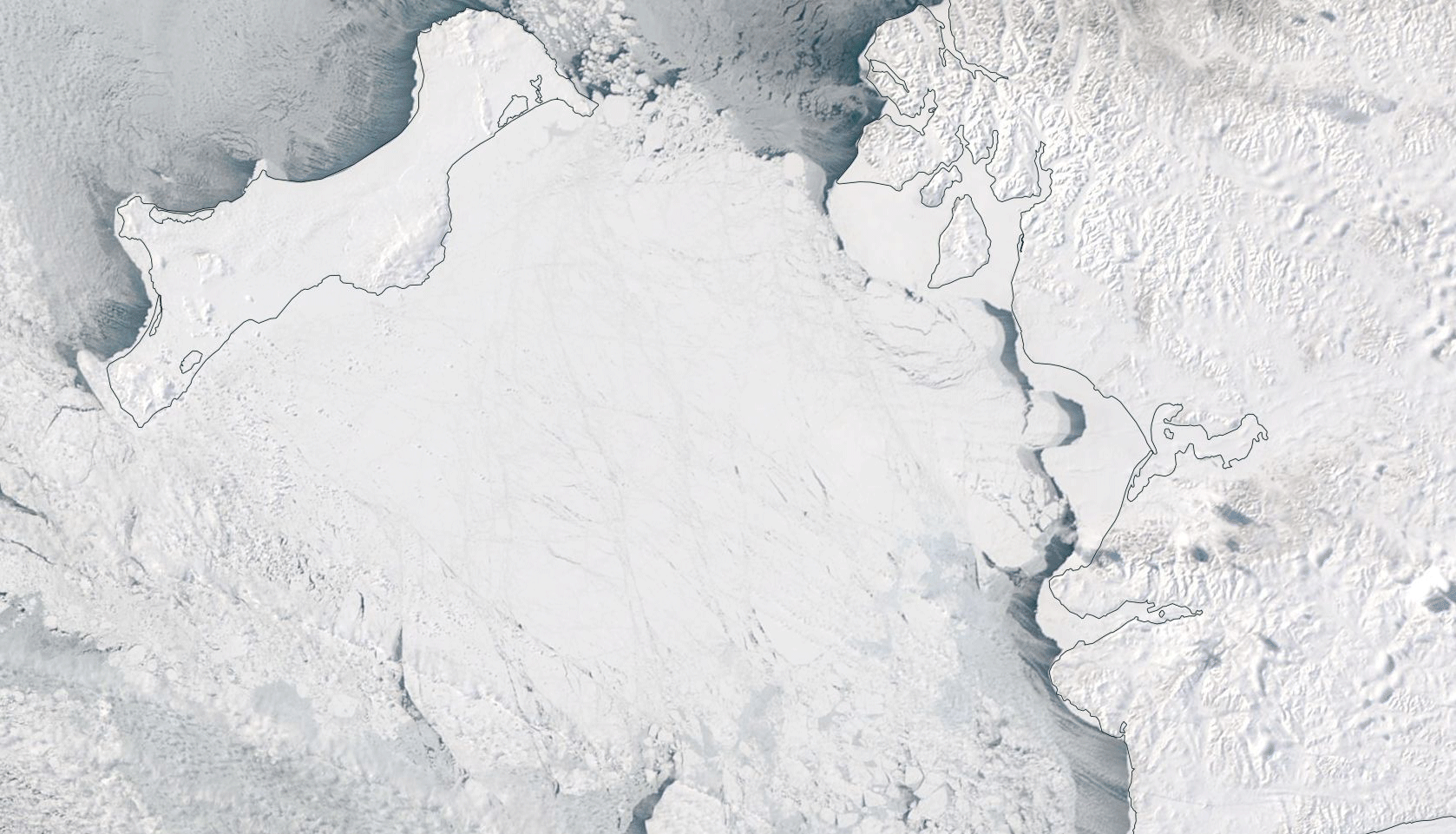
A comparison of Terra satellite images of Bering Sea waters between Alaska and Russia, one acquired on March 24, 2000, and the other on March 25, 2018. (Images: NASA Worldview. Animation: Tom Yulsman)
The animation above shows a very different kind of human impact: the effect of human-caused warming on Arctic sea ice.
The Terra imagery shows a closeup of the Bering Sea near the Bering Strait separating Alaska and Russia. The big island at upper left is St. Lawrence Island. The actual Bering Strait is beyond the frame toward the lower right.

Source: NSIDC
In the image acquired in 2000, the waters are choked with floating sea ice. In the one acquired this year, there is dramatically less ice coverage.
Sea ice extent in the Bering Sea at the end of March this year was far below average. And for the Arctic overall, sea ice extent for March 2018 was the second lowest in the 1979 to 2018 satellite record.
Here’s some background from a monthly report by the National Snow and Ice Data Center:
Unusually warm conditions and some prominent warm air intrusions characterized the 2017 to 2018 winter over the Arctic Ocean. Mean air temperature for the months of December, January, and February combined (the climatological winter season) was as much as 7 degrees Celsius (13 degrees Fahrenheit) higher than average, and nearly the entire Arctic Ocean was 4 degrees Celsius (7 degrees Fahrenheit) higher than average.
Shrinking sea ice in the Arctic — a region that has been warming twice as fast as the world as a whole for the past 50 years — is one of the most visible manifestations of human-caused climate change.
Lastly, an animation revealing the impact of drought on a piece of infrastructure that helps supply water for the needs of some 25 million people:
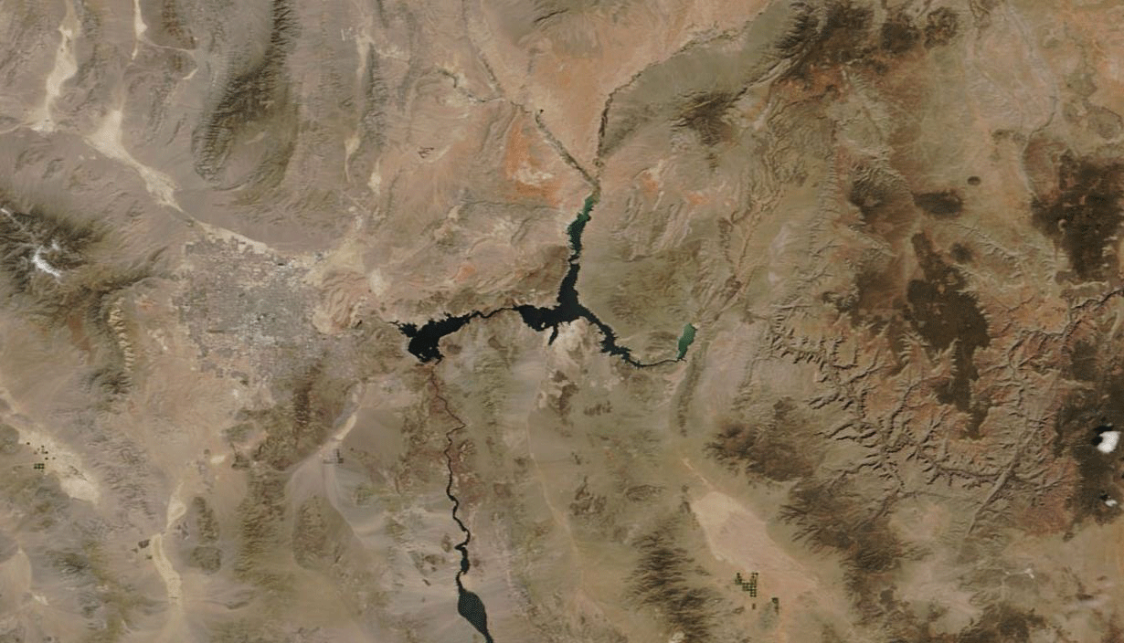
This comparison consists of Terra images showing Lake Mead and Las Vegas (to the left of the lake). One was acquired on April 2, 2000 and the other on the same date in 2018. The lake has shrunk significantly thanks to drought, while the city has grown enormously. (Images: NASA Worldview. Animation: Tom Yulsman)
The dark feature in the images above is Lake Mead, the largest U.S. reservoir in terms of its capacity. One of the Terra images in the animation was acquired in April of 2000, when the reservoir’s level was almost at its highest ever recorded.
In the 18 years since, drought has caused the lake to drop by more than 100 feet — a change so dramatic that it is readily obvious from space. Mead now stands at close to its lowest capacity since the reservoir filled in the 1930s.
There’s another noteworthy sign of change in this animation. Look to the left (west) of Lake Mead and you’ll see a grayish area in the desert — Las Vegas. Look at how much it has grown since the year 2000.
The city does get more than 90 percent of its water from Lake Mead. So it’s tempting to blame Las Vegas for the draining of the reservoir. But this would be a simplistic explanation.
As the animation above shows quite graphically, Vegas has grown by leaps and bounds. In fact, between 2002 and 2012 the metropolitan area grew by more than 400,000 people, and it also added 25,000 hotel rooms. Yet during this same period, total annual water use dropped by 110 million cubic meters.
That’s thanks to vigorous efforts at water conservation. And it shows what we can do when we get serious about being better stewards of Earth’s resources.