Check out this cool animation illustrating California's dramatic change in fortunes
Author Vishay SinghPosted on Categories Discover Magazine
The animation, based on data from a NASA airborne observatory, show just how much the state’s snowpack has grown
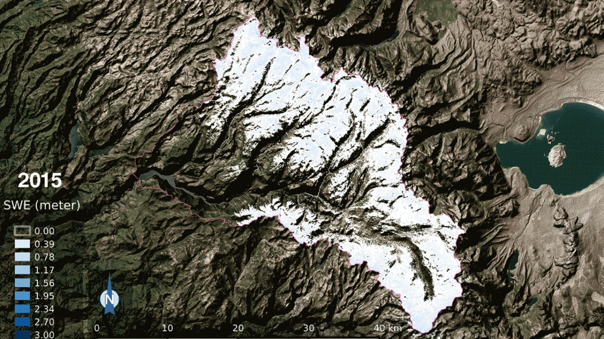
Snow water equivalent — the water content of snow — in California’s Tuolumne River Basin, as seen in an animation comparing 2015 and 2017. Lighter blue indicates less snow, deeper blue is more snow (see color bar at left). The 2017 snow water equivalent was 21 times greater than 2015, which was the lowest snowpack on record. (Source: NASA)
The incredible impact of California’s drought-busting deluges has now become even clearer, thanks to this compelling new animation from NASA.
You’re looking at a comparison of snowpack on April 1, 2015 and 2017 in the Tuolumne River Basin of the Sierra Nevada range. Famous Mono Lake is to the right. The entire basin spans more than 1,600 square miles, an area larger than the state of Rhode Island.
The data that underlie these images, collected by instruments aboard NASA’s Airborne Snow Observatory, or ASO, tell a dramatic story: Not only is the snowpack in the basin currently 21 times greater than it was in 2015; it is also larger than the four previous years of snowpack — combined.
This is great news for San Francisco and California’s Central Valley growers, since the Tuolumne basin is a major source of water for both.
In the 2017 image, the darkest blue colors show areas where the snow water equivalent, or SWE, is so high that if the snowpack were melted instantaneously these areas would be covered in water to a depth of 3 meters, or nearly 10 feet.
Based on measurements made on the ground, California’s overall snowpack for 2017 is close to the largest on record. But these measurements are made only in spot locations throughout the mountains. By contrast, NASA’s Airborne Snow Observatory, or ASO, can provide valuable, continuous detail across an entire basin.
Because of this, ASO has helped water managers dramatically improve their estimates of how much water might come coursing out of the mountains with spring runoff.
According to NASA:
Before 2013, when the ASO program began, errors in forecasting the total Sierra Nevada snowmelt-season runoff were frequently greater than 20 percent and occasionally greater than 40 percent. Now, errors in forecasting runoff from basins that ASO monitors have dropped to less than 2 percent.
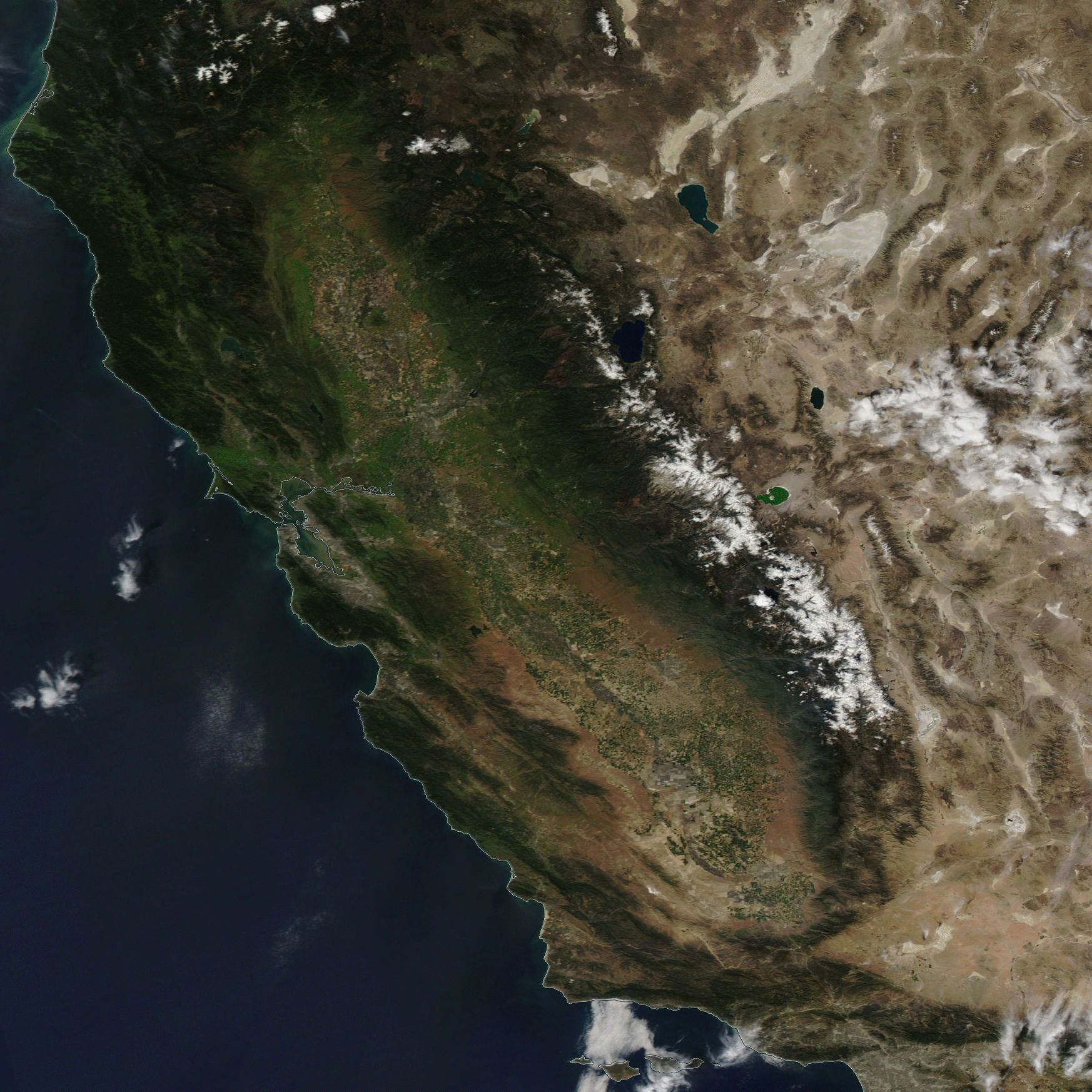
A comparison of snowpack in California’s Sierra Nevada range, using images acquired by NASA’s Aqua satellite on March 29, 2015 and April 1, 2017. The Sierra run diagonally across roughly the middle of the image. (Images: NASA Worldview. Animation: Tom Yulsman)
I made the animation above to compare snowpack across the entire Sierra in 2015 and 2017, as seen from space. Nuff said.